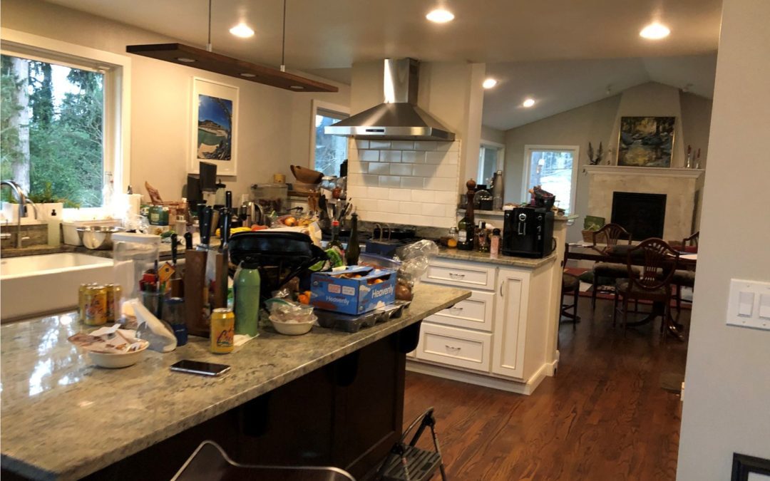
This homeowner is an amazing semi-professional home chef, but in order to enhance his craft, create new recipes and improve his skills this kitchen isn’t working anymore. The kitchen triangle is off, the island is in the way, and there just isn’t enough countertop space.
After several design ideas and contractor ideas, they got stuck with the execution and felt something spectacular was missing from the designs and so they contracted me.
They were looking for a partnership with the designer and someone who would understand them, while cracking the code of not just a larger kitchen, but foremost the rooflines.
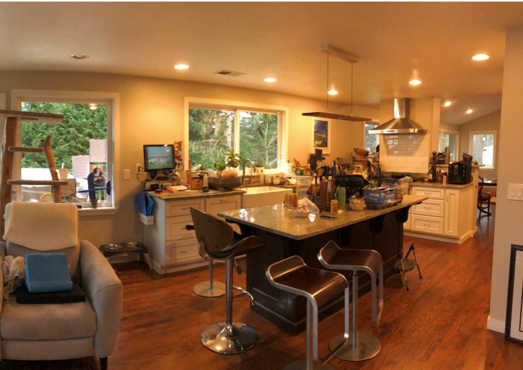
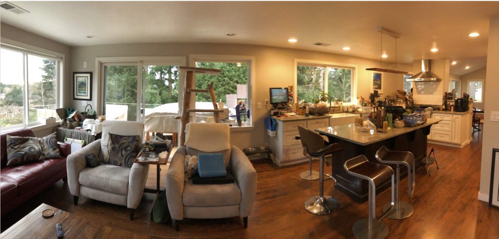
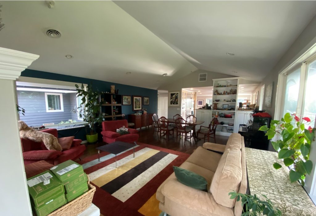
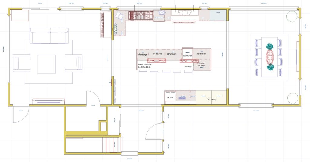
The home was originally built in the seventies and now with several additions later, the home feels disconnected, with large footprints in the wrong spot. And the two rooflines that divide the main floor in two.
We have a flat roof over the family room and kitchen. And a gable roof (triangular shaped) in the formal living room and dining room. Also, the footprint of the flat roof area is smaller than the gable roof area. Which makes it feel crammed on one side and lost in space in the other.
During our first meeting we mapped out new ideas, we looked at several different style kitchens and the homeowner showed me the new high-end appliances that will be installed in the new Chef’s kitchen.
When I see a home like this – I get so excited! My brain starts spinning and I get all these great ideas.

JANUARY 2020: FIRST DESIGN ROUND
After weeks of designing, playing with floor plans and cracking the code of this lay-out.
There are 2 major obstacles in this design:
1.Trying to figure out the most important design feature of this space: 2 roof lines: flat and gable
2.The Electrical Panel (EP) can not be moved
I presented 5 floor plans ideas for this kitchen and home, and in total we have 11 different options.
We are looking at a very modern and chef’s kitchen.
Getting ready to show them to my clients. Mood boards are glued and photographed. Time to get ready.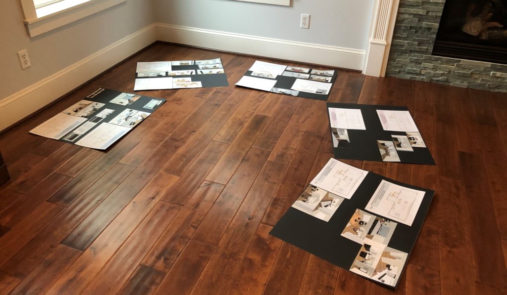
During this presentation I take my clients on their design journey: starting with the most common ideas, to several different out of the box options, to keeping it more simple.
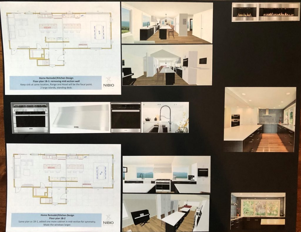
Design 1: Keeping it close to the current floor plan.
Range and Hood will be the focal point at the intersection of the 2 roof lines.
Removing the mid section wall, to add more cabinetry. Two large islands with lots of prep space and a standing desk.
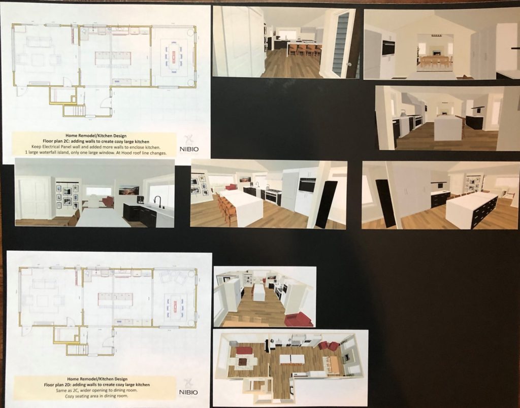
Design 2: Embracing the Electrical Panel and add more walls to enclose kitchen, creating a cozy large kitchen.
1 large waterfall island, only one large window. The Hood as a focal point where the roof line changes.
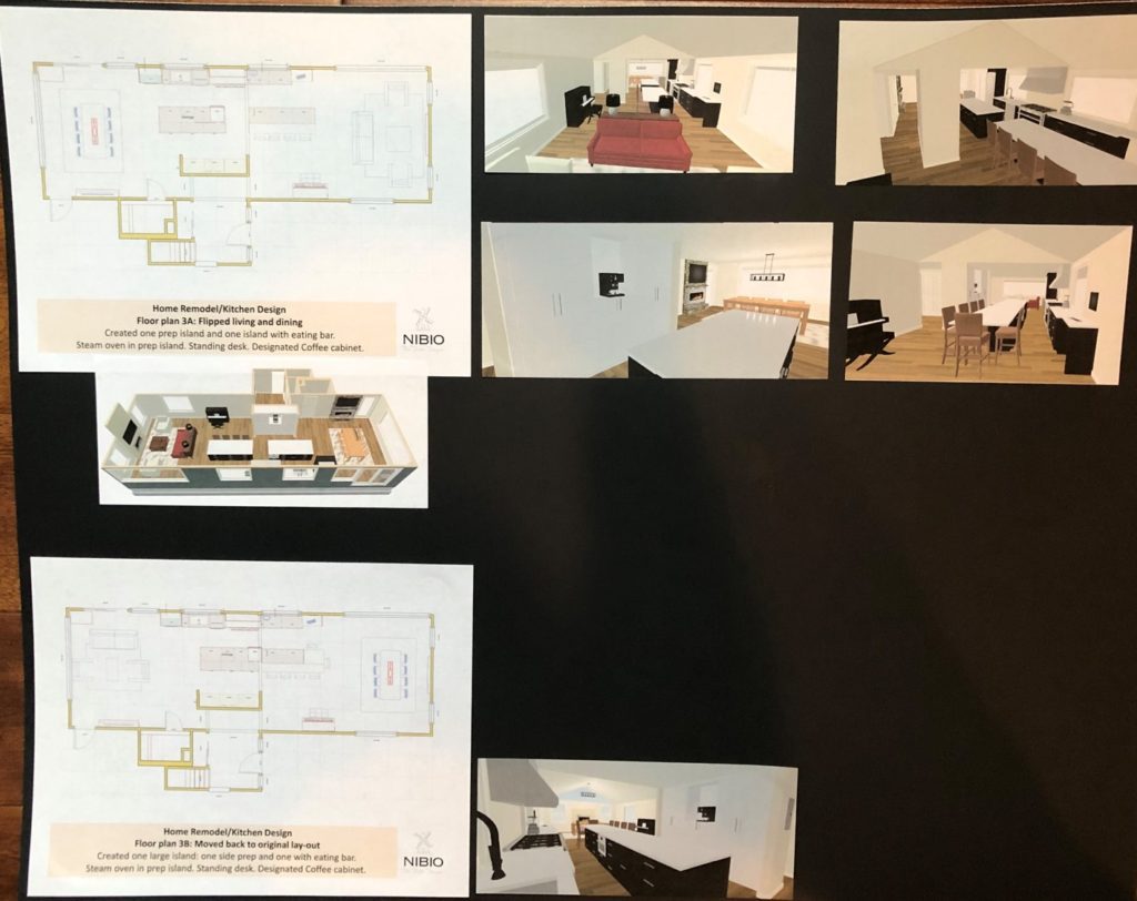
Design 3: Flipped living and dining
Created one prep island and one island with eating bar. Steam oven in prep island. Standing desk. Designated Coffee cabinet.
As there is more room in the dining room, it would be nice to explore what the flipped lay-out looks like.
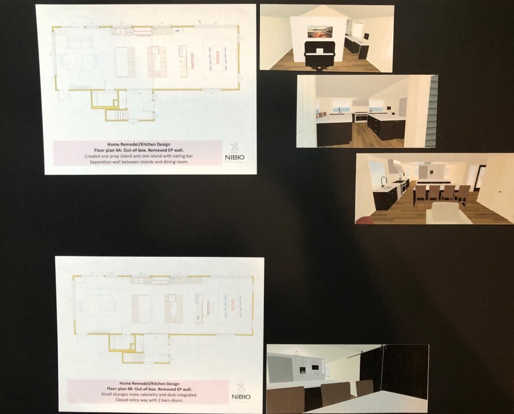
Design 4: Out-of-box with 3 blocks.
Removed EP wall, which is a big expense. This drawing is just to show what it would look like and if this is something we would want to proceed with.
Created one prep island and one island with eating bar. Separation wall between islands and dining room.
Design 5: Cooking in niche
Range and Hood are designated in niche. Fridge in the middle.
Created small prep island and large island with eating bar. Piano and desk together.

WATCH THE VIDEO WITH THE EXPLANTION:
FEBRUARY 2020: SECOND DESIGN ROUND
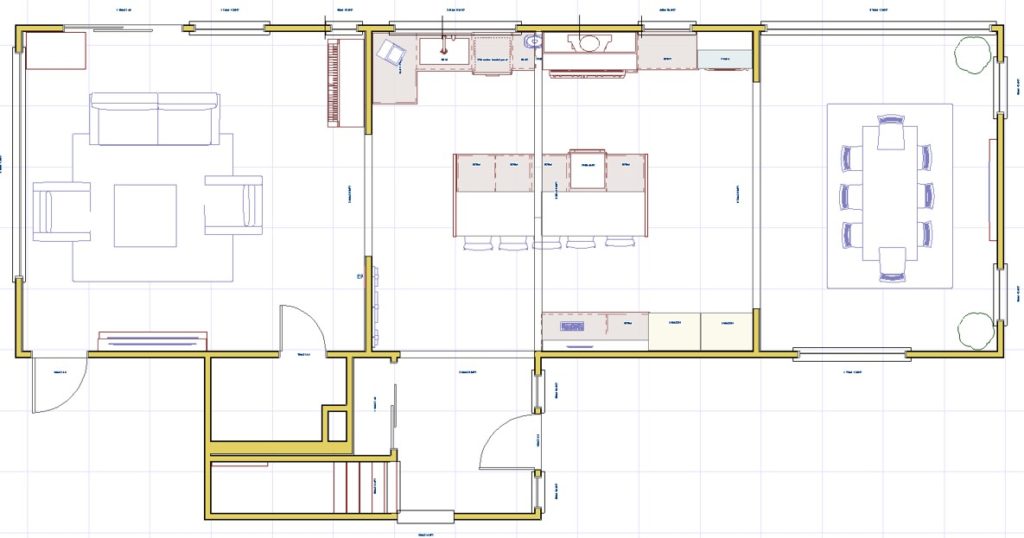
My clients LOVED Design 2: “Embracing the Electrical Panel and add more walls to enclose kitchen, creating a cozy large kitchen. With a large waterfall island, and one large window. The Hood as a focal point where the roof line changes”.
So in this design round, I cleaned up my drawings and detailed some more; cabinetry, island, and custom built cabinets.
This kitchen is all they have ever dreamt off. It totally makes sense to move forward with this design.
Who doesn’t want to have a 11-foot island?
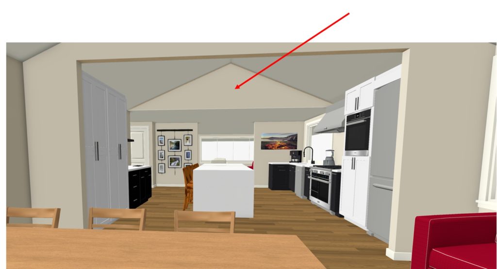
And we are also getting a structural engineer out to see if we can somehow get rid of a part of the flat roof.
The Floor plan were are working with in Design Round #2
And a more visual representation.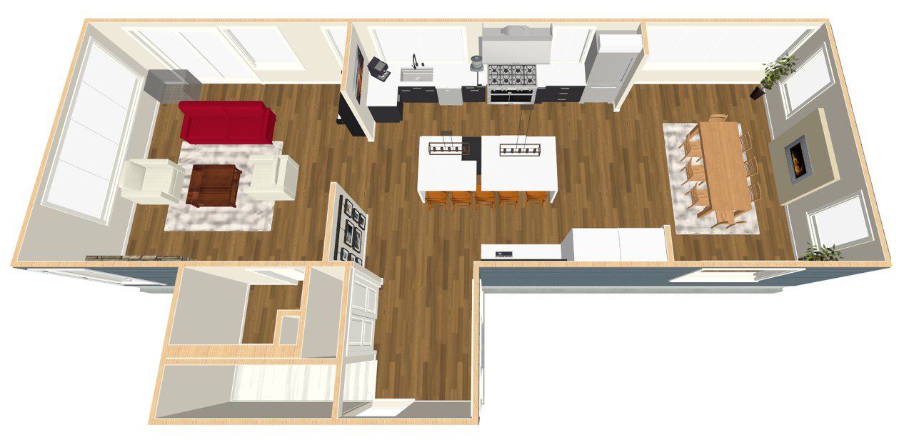
LATE FEBRUARY 2020: THIRD DESIGN ROUND
In the meantime we met with the structural engineer and we can get rid off the flat roof above the kitchen area.
This news is the best we can get. It will make the kitchen twice as big.
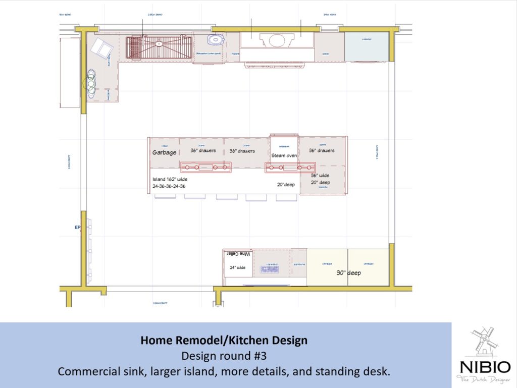
Time to design the last details for the kitchen. Adding all the bells and whistles: 56″ commercial sink, 2 faucets, a XL-island of 14-feet!
Custom build cabinets for all the kitchen appliances and the perfect work station.
Ready to submit drawings to the Kitchen showroom. And shop for countertops and backsplashes.
1. Kitchen floor plan
2. Main Level floor plan
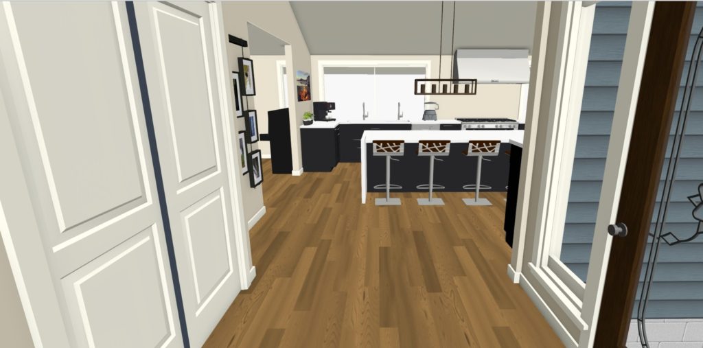
3. View into kitchen
4. View from Dining room
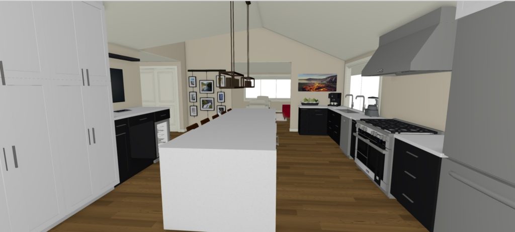
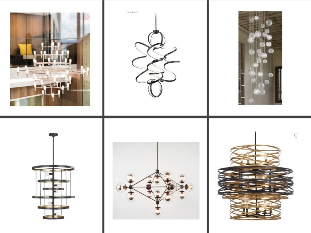
With the new rooflines we will have a lot of ceiling space in the dining room, we are looking a focal point chandeliers to compliment the 8-foot dining room table.
SHOPPING TRIP TO KITCHEN SHOWROOM (Mid-February)
My clients love to visit the kitchen showroom. First, it means that their kitchen remodel is becoming more tangible. Second, they lovappreciate the professionality and knowledge of this particular showroom.
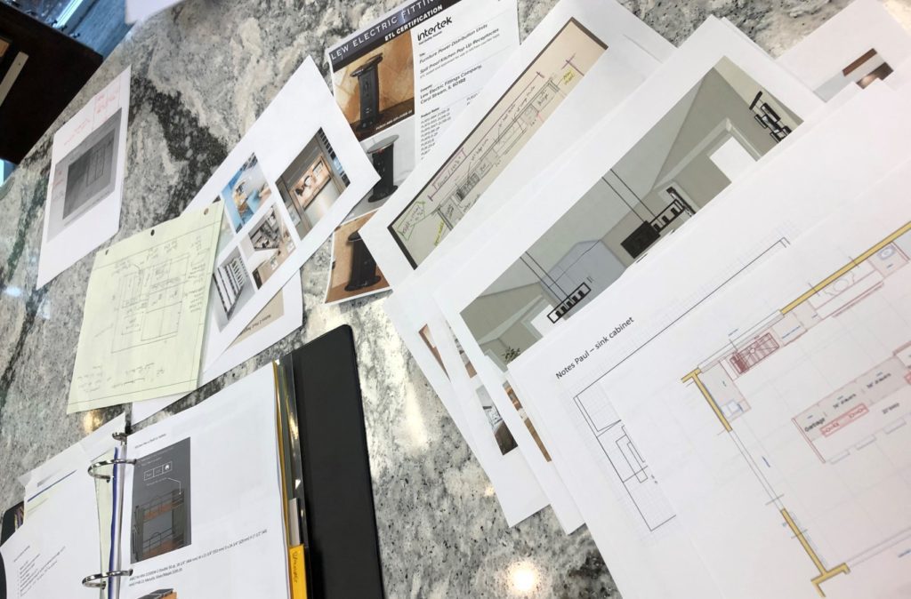
This is one of the most difficult kitchens as a lot of the cabinets are custom-built, have different depths and this one needs to accommodate a 56″ commercial sink, 2 faucets, and a 14-feet XL-island!
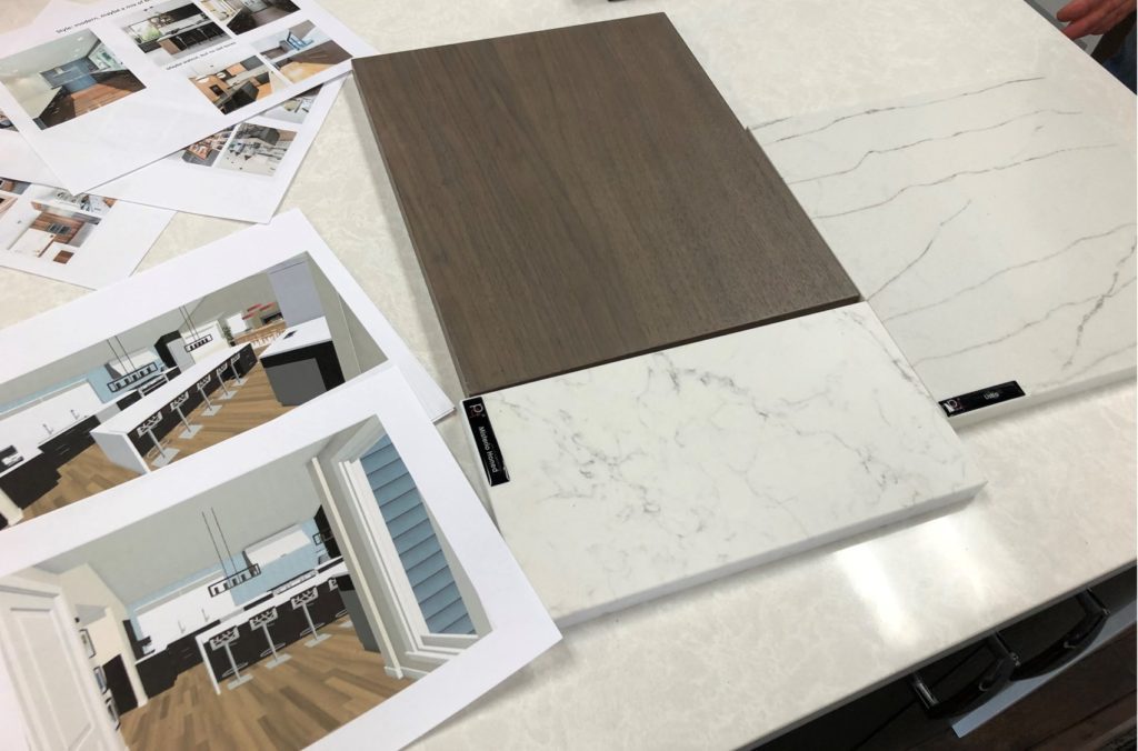
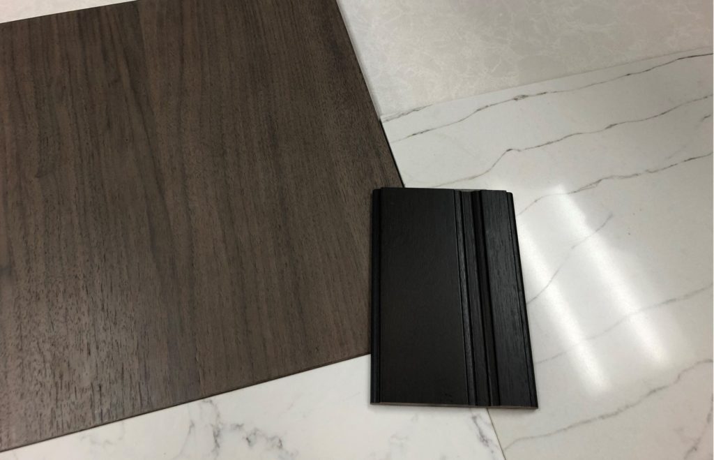
At this visit, we went through all the custom-built cabinetry and flow of the kitchen. And we looked at colors. My clients are looking for a very modern look and are narrowing it down to 2 colors: black or a custom walnut color.
I also shopped for lighting and can lighting for the kitchen and the home. Crescent Lighting in Kirkland, is in a new location and have a beautiful new showroom!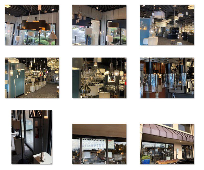
SHOPPING TRIP TO KITCHEN SHOWROOM EARLY MARCH
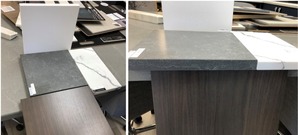
What a great and productive day. We started at the Kitchen showroom, went over the cabinetry details and they had our custom cabinet piece: A perfect walnut color!
With the exact color of the cabinets, it would be easy to pair it with the right countertop color.
SO HERE IT IS!
*Tall white part: Thin Marble large piece as backsplash behind stove.
*Concrete slab: all perimeter countertops
*White countertops with veining: waterfall island
*Walnut cabinetry on perimeter and island
AND FINALLY, WE CAN START REMODELLING, AFTER A LONG WAIT DUE TO CORONA AND SOURCING OF MATERIALS.
JULY-2021: FIRST DEMO
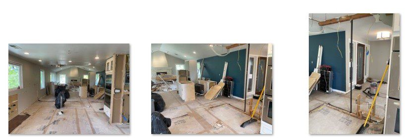
DOWN TO THE STUDS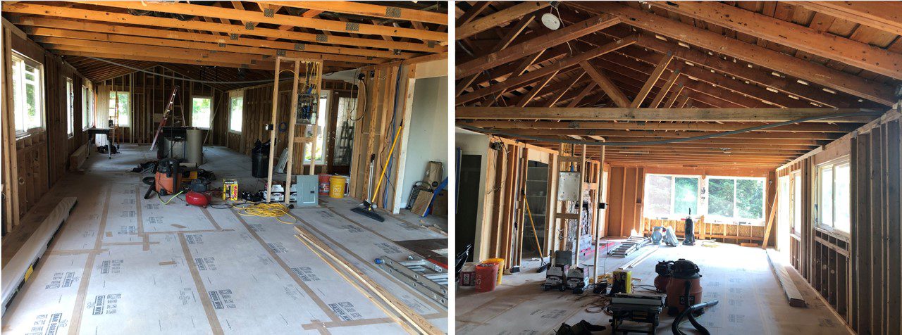
WALLS ARE FURRED OUT, SO WE CAN ASS MORE AND BETTER INSULATION.
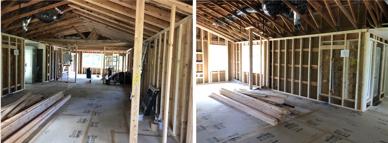
SEPT-2020
AFTER SOME DELAY WE HAVE THE INSULATION COMPANY COME OUT

AND THEN THE DRYWALLERS

THE ELECTRICIANS MADE SURE WE ALL THE CAN LIGHTS WE NEEDED

DECEMBER-2021 FINALLY THE CABINETS ARRIVED
CABINETS WITH A GORGEOUS CUSTOM-MADE BROWN STAIN.

AND THE ICING ON THE CAKE: COUNTERTOPS.
FOR THE BIGGEST ISLAND I HAVE DESIGNED YEAR TO DATE.
13.5 ft x 4 ft (410 cm x 122 cm)

