Main Floor Remodel: Out-of-the box solutions
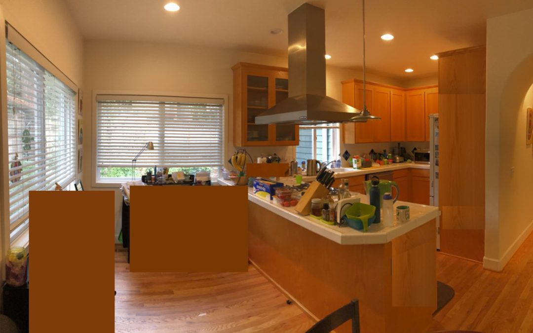
This homeowner reached out to me, because their home and the flow in this small kitchen wasn’t working anymore. The main concern for the mom is that she can’t keep an eye on the children, while prepping and cooking in the kitchen. And with a large family and all on different schedules, she uses the kitchen a lot.
Back in the 80s this home was considered a high-end home and was luxurious with a grand entry and several rooms, perfect to host large gatherings. However, now in this era, the home feels very disconnected and the kitchen doesn’t work anymore as we have changed our habits in the kitchen.
Her once organized and gorgeous kitchen is now overflowing with appliances and utensils. The peninsula blocks the kitchen entry, and they are unable to use the eating bar as the cooktop is right there. The tiny and awkwardly shaped pantry is stuffed full. The only person who has the best access in the pantry is the 1 year old. This mom wants an open concept kitchen and better use of space with a bigger pantry and a flow that would make sense. The kitchen is the heart of the home and needs to be more functional and practical to be in.
During our first meeting we mapped out a new layout, we looked at several different style kitchens and the homeowner found some kitchens she was drawn to.
The homeowners are open to changing the functionality of the rooms, as well as looking at options to move walls and rooms to make the most of the space and create a better flow of spaces.
When I see a home like this – I only see potential. My brain starts racing and I get all these great ideas. Now it is my time to design and crack the code of this beautiful home and give the homeowners the home they have desired for so long.

SEPTEMBER 2019 UPDATE
This Design Journey takes us through several different lay-out, and several different kitchens.
The first set of plans is with the green and wood elements kitchen. White or gray cabinets, with a dark green island and just enough wood to make the kitchen special.
Floor plan B
Optimizing the kitchen with minimal remodel. Omit corner pantry.
Change peninsula to island. Create workstation for mom.

Floor plan F: Changing the left window to the same size as sink window.Optimizing the peninsula, with additional cabinets and workstation for mom.
Separate space for cooking, lots of room for fridge, and large stand-alone pantry.

For the next plans I used deep dark blue/black cabinetry. The backsplash is a yellow’ish brick, and I have created an accent wall with red brick,
as I think that is the coolest wall ever.
Floor plan G: Removing both windows, changing the entire back wall and adding a new large 6 ft window.
Changing the entire back wall gives us lots of opportunities to create a large dream kitchen.
Balancing the kitchen out, adding big island. Storage cabinet for mom.

For the last designs I go out-of-the-box, keeping the deep dark blue/black cabinetry, but changing the backsplash to a more Moroccan style tile.
Floor plan L: Out-of-box change the entire footprint of your house.
This entails the biggest remodel of all 4 designs; HOWEVER, it also gives the opportunity to keep the “old” kitchen functioning while we build the new kitchen.
Changing all the rooms to create the biggest dream kitchen, an intimate dining room close to the kitchen, giving room space to the living room, moving piano over. 
Sharing the video where you can hear all about the design process for this this First Design Reveal.
OCTOBER 2019 UPDATE – DESIGN ROUND #2: exploring the option to create a large Butler’s pantry and see what happens to the overall plan.
After my presentation from 2 weeks ago, my clients fell in love all the possibilities in Floor plan L: Out-of-box change the entire footprint of your house. Moving the kitchen in the living room, living room in the music room, music room in the old pantry.
Plan 1: Trying one more time to keep as close to the original plan; we lose the living room for a butlers pantry.
Moved fridge over to other side, keep living and music room.

Plan 2:Added huge Butler’s pantry with barn door. Base and upper cabinets in U-shape.
Plan 3: Diner bench with plenty of seating. Butler’s pantry less deep, with pocket door. 
Plan 4: One wall dedicated for cooking, stove centered. Island centered.Huge island, no cabinetry.
Butler’s pantry has long storage wall.

Plan 5: Smaller Butler’s pantry with homework room.

What happens if you have to decide between 5 different designs you all love? We take scissors 🙂 and create the FINAL plan for the remodel.
With every design round you will get a new set of mood boards. And I ALWAYS bring my LARGE computer to show you your designs in 3-D in your own home.
TIME TO SHOP FOR KITCHEN CABINET COLORS
From left to right: Regal Blue, white and deep black.

TIME TO SHOP FOR TILES AND BACKSPLASHES
We visited this beautiful tile store in Art Tile Company in Seattle. A gorgeous showroom with a huge variety of tiles and styles. Just the store we had been looking for!!!
We spend hours there to make beautiful compositions for the kitchen and master bathroom. The client brought home several sample boards to see what tile they both like best.

